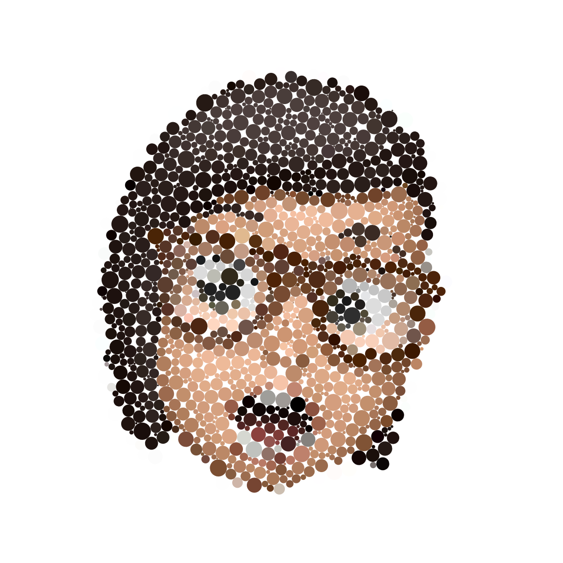
Tableau has chart type called “Packed Bubble Chart”, while I haven’t really utilized packed bubble chart much, I always thought they are fun and beautiful. I wanted to try creating same chart using R, and I came across package called packcircles.
Reading vignettes was really helpful to figure out how to use the package!!
- introduction vignettes - Progressive packing vignettes to get started on using this package.
Creating Bubble Packed Abstract Art…
I didn’t really have data sets handy to use it for this type of chart, so I’ve decided to play around with image. Initially I wanted to create images used to test colour blindness, but I wasn’t sure what colour palettes should be used to create these images.
Since I currently love Memoji on my iPhone, so I’ve decided I’d use Memoji image as base to create abstract art.
Steps
- Step 1. Import image and convert image to data frame, so you can extract colour value (RGB)
- Step 2. Genearate circle packing layout using circleProgressiveLayout function. The resulting data frame here contains center points of circle (x,y) and its radius.
- Step 3. Convert x & y coordinate from data frame in step 2 so that you can figure out what colour to fill the circle. i.e. Data Frame from Step 1 and Step 2 should be joined, so you need to adjust the scaling.
- Step 4. Create data frame using circleLayoutVertices function for plotting with ggplot2. The resulting data frame now have specified amount of points per indivisual circle so that you can use geom_path or geom_polygon to draw.
- Step 5. Join data from Step 4 with colour value from Step 3, so that you can use geom_polygon with fill value to colour the circle!
library(tidyverse) ## I need tidyverse for everything :)
library(imager) ## to create data frame from image
library(scales) ## rescale function is so handy!
library(packcircles) ## making circle packing easy!

## Step 1
im <- load.image("https://farm5.staticflickr.com/4868/45503751845_948f121563_z.jpg") #memoji2


## if you want to take a look at image.. :)
#plot(im)

## Convert Image into Data Frame
im.df.colour <- im %>%
  as.data.frame(wide="c") %>% ## so that rgb value is in separate column.
  rename(im_x=x,im_y=y) %>%
  mutate(hex=rgb(c.1,c.2,c.3))

## Step 2 using circleProgressiveLayout function.
## Generate circle packing layout using rbeta distribution as size of circles
pack_layout <- circleProgressiveLayout(rbeta(2000,1,2), sizetype='area') %>%
## Step 3 - I want to figure out what colour to use, so I want layout & image df to have same scaling.
  mutate(im_x=floor(rescale(x,to=range(im.df.colour$im_x))),
         im_y=floor(rescale(y,to=range(im.df.colour$im_y))),
         ## also generate id, so i can join the data frame easily later!
         id=row_number()) %>%
  inner_join(im.df.colour %>% select(im_x,im_y,hex), by=c("im_x","im_y"))


## Step 4
## Using the layout above create data frame using circleLayoutVertices function so that you can plot circle using ggplot2
data_gg <- circleLayoutVertices(pack_layout) %>%
  inner_join(pack_layout %>% select(id,hex), by=c("id"))

## Step 5
data_gg %>%
  ggplot(aes(x=x,y=y,group=id)) +
  geom_polygon(aes(fill=hex)) +
  scale_fill_identity() +
  coord_equal() +
  scale_y_reverse() +  ## you need to reverse y-axis
theme_void() 

Just few more of these…
Good image to use is square image with above, but it’s fun turning into logo & images!!!
Below are just few more things I’ve experimented with circle packing technique…
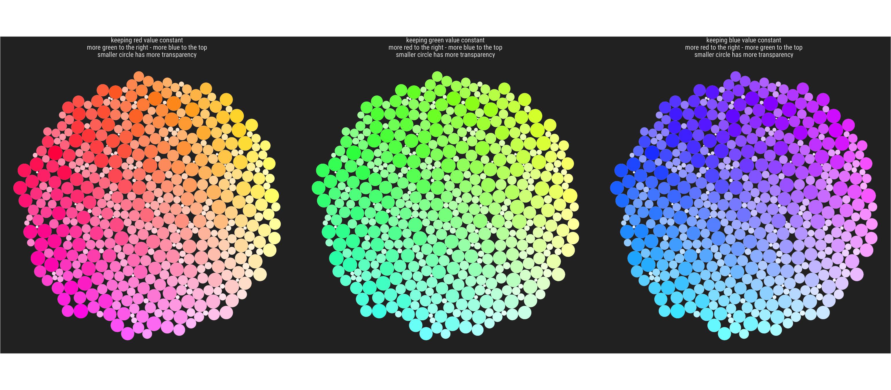
Experimenting with RGB Colour…
## Generate layout from 500 uniformly distributed number 0 to 1 as area.
pack_layout1 <- circleProgressiveLayout(runif(n=500), sizetype='area')

## I want to colour each circle with different rgb value, so I'll append data
pack_layout1 <- pack_layout1 %>%
  mutate(hex_r=rgb(1,rescale(x),rescale(y),rescale(radius)),
         hex_g=rgb(rescale(x),1,rescale(y),rescale(radius)),
         hex_b=rgb(rescale(x),rescale(y),1,rescale(radius)),
         id = row_number()) ## append id, so you can join this table later.

## pack_layout1 contains data where center of circle should be placed with its radius.
## Now generate data so that you can actually draw circle using ggplot2
data_gg1 <- circleLayoutVertices(pack_layout1, npoints=25)
## notice now you have for each circle, you have 25 x and y coordinates to draw circle!


## Since the colour I want to use for each circle is retained in pack_layout1 data frame, I want to combine the info.  Also I want to create 3 sets of different colouring. I want to make long table.
data_gg1 <- data_gg1 %>% inner_join(pack_layout1 %>% select(-x,-y), by=c("id"))

## I want to create 3 different coloured variations, so convert above table to long format.
data_gg_long <- data_gg1 %>%
  gather(key="colour_group",value="hex",hex_r:hex_b) %>%
  mutate(colour_group = factor(colour_group,levels=c("hex_r","hex_g","hex_b"),
                               labels=c("keeping red value constant\nmore green to the right - more blue to the top\nsmaller circle has more transparency",
                                       "keeping green value constant\nmore red to the right - more blue to the top\nsmaller circle has more transparency",
                                       "keeping blue value constant\nmore red to the right - more green to the top\nsmaller circle has more transparency")))


## Now the fun part!
data_gg_long %>%
  ggplot(aes(x=x,y=y)) +
  geom_polygon(aes(group=id),fill="#ffffff") +  ## first draw all circle white.
  geom_polygon(aes(group=id, fill=hex)) + ## then colour with value with some transparency
  coord_equal() +
  theme_void() +
  scale_fill_identity() +
  scale_y_reverse() +
  facet_wrap(~colour_group) +
  theme(plot.background=element_rect(fill="#000000de"),
        strip.text=element_text(family="Roboto Condensed", color="#ffffffde"))
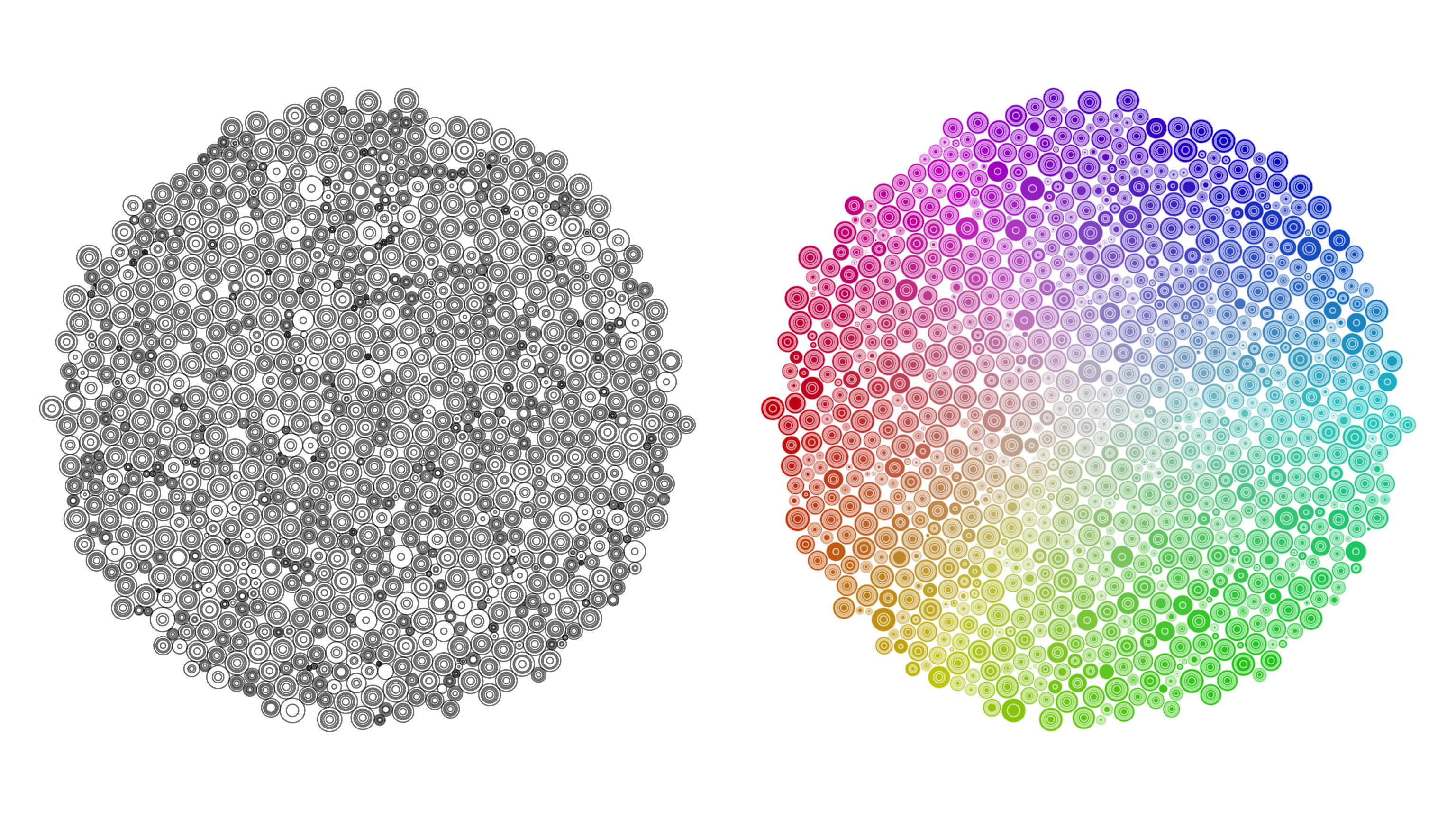
Drawing Smaller Circles Inside of Circles
## Instead of using uniform distribution, used beta distribution this time!
pack_layout2 <- circleProgressiveLayout(rbeta(1000,1,1), sizetype='area')

## This time I want to fill circle using hue value...
pack_layout2  <- pack_layout2 %>%
  mutate(r = sqrt(x^2 + y^2), ## calculate distance from 0,0 coordinate
         angle_t = atan2(y,x),  ## The arc-tangent of two arguments atan2(y, x) returns the angle between the x-axis and the vector from the origin to (x, y)
         angle = rescale(angle_t, from=c(-pi,pi)), ## convert theta value to value betwwen 0 and 1
         hex = hsv(h=angle, s=rescale(r), v=0.8),
         id = row_number())

## use circleLayoutVertices function to generate data frame for ggplot2 & bring colour info.
data_gg2 <- circleLayoutVertices(pack_layout2,npoints=25) %>%
  inner_join(pack_layout2 %>% select(-x,-y), by=c("id"))

## Now create data for inner circles!! But I'm sampling so that NOT all circle has inner circles! I want to pick more bigger circles than smaller circle, so using raidus as weight to sample.
data_gg2_1 <- circleLayoutVertices(pack_layout2 %>%
                                     sample_n(800, weight=radius) %>%
                                     mutate(radius=0.7*radius), npoints=25) ## I want to draw smaller circle, so shrink the radius
data_gg2_2 <- circleLayoutVertices(pack_layout2 %>%
                                     sample_n(700,weight=radius) %>%
                                     mutate(radius=0.5*radius),npoints=25)
data_gg2_3 <- circleLayoutVertices(pack_layout2 %>%
                                     sample_n(900,weight=radius) %>%
                                     mutate(radius=0.3*radius),npoints=25)

## Draw Black and White Version
bw <-data_gg2 %>%
  ggplot(aes(x=x,y=y, group=id)) +
  geom_path(data=data_gg2, size=0.5, color="#00000090") +
  geom_path(data=data_gg2_1,size=1, color="#00000090") +
  geom_path(data=data_gg2_2,size=0.5, color="#00000090") +
  geom_path(data=data_gg2_3,size=0.5, color="#00000090") +
  scale_fill_identity() +
  scale_color_identity() +
  theme_void() +
  coord_fixed()

## Draw colourful version
hue <-data_gg2 %>%
  ggplot(aes(x=x,y=y, group=id)) +
  geom_polygon(aes(fill=hex)) +
  geom_path(data=data_gg2, size=0.5, color="#ffffff90") +
  geom_path(data=data_gg2_1,size=1, color="#ffffff90") +
  geom_path(data=data_gg2_2,size=0.5, color="#ffffff90") +
  geom_path(data=data_gg2_3,size=0.5, color="#ffffff90") +
  scale_fill_identity() +
  scale_color_identity() +
  theme_void() +
  coord_fixed()

library(patchwork)
bw + hue

Share this post
Twitter
Google+
Facebook
Reddit
LinkedIn
Pinterest
Email