While reading the news that Ireland becomes world’s first country to divest from fossil fuels, I just got curious how do we measure “green-ness” of country when we rank them in general, and I came across the Environmental Performance Index page with ranking table.
Table contained 180 countries with some numerics values for Environment Performance Index, “Enviornmental Health”, “Ecosystem Vitality”.
I thought it would be interesting to plot them using ggplot2.
First I needed to get data, so I’ve used rvest and scaraped data from website into data frame.
library(tidyverse)
library(knitr)
library(rvest)

epi_2018_site <- read_html("https://epi.envirocenter.yale.edu/epi-topline")
epi_2018_df <- epi_2018_site %>%
  html_table() %>% as.data.frame()


## Which Countries are the top 5 countries
epi_2018_df %>% arrange(EPI.Ranking) %>% head(n=5) %>% kable()| Country | EPI.Ranking | Environmental.Performance.Index | Environmental.Health | Ecosystem.Vitality |
|---|---|---|---|---|
| Switzerland | 1 | 87.42 | 93.57 | 83.32 |
| France | 2 | 83.95 | 95.71 | 76.11 |
| Denmark | 3 | 81.60 | 98.20 | 70.53 |
| Malta | 4 | 80.90 | 93.80 | 72.30 |
| Sweden | 5 | 80.51 | 94.41 | 71.24 |
## Which Countries are the bottom 5?
epi_2018_df %>% arrange(EPI.Ranking) %>% tail(n=5) %>% kable()| Country | EPI.Ranking | Environmental.Performance.Index | Environmental.Health | Ecosystem.Vitality | |
|---|---|---|---|---|---|
| 176 | Nepal | 176 | 31.44 | 10.54 | 45.38 |
| 177 | India | 177 | 30.57 | 9.32 | 44.74 |
| 178 | Dem. Rep. Congo | 178 | 30.41 | 19.70 | 37.56 |
| 179 | Bangladesh | 179 | 29.56 | 11.96 | 41.29 |
| 180 | Burundi | 180 | 27.43 | 25.69 | 28.59 |
So when it comes to ranking in 2018, Top 5 countries are 1. Switzlerland, 2. France, 3. Denmark, 4. Malta, 5. Sweden. Bottom 5 countries for 2018 are , 180. Burundi, 179. Bangladesh, 178. Dem. Rep.Congo, 177. India, 176. Nepal.
I now wanted to plot them as scatter plot, with x-axis with Environmental Health score, and y-axis with Ecosystem Vitality score. I’ve coloured dots with Environmental Performance Index.
library(hrbrthemes) ## I love this theme for ggplot!
library(ggrepel) ## so that text don't overlap


epi_2018_df %>%
  arrange(EPI.Ranking) %>%
  ggplot(aes(x=Environmental.Health , y= Ecosystem.Vitality)) +
  geom_point(aes(color=Environmental.Performance.Index)) +
  geom_path(size=0.2, color="#33333390", linetype=3)+
  scale_color_viridis_c(name="EPI") +
  theme_ipsum_rc() +
  geom_smooth(method="lm", se=F, color="#33333330") +
  geom_text_repel(aes(label=paste0(EPI.Ranking,".",Country)), data = . %>% filter(EPI.Ranking<=10|EPI.Ranking>=170|Country %in% c("Canada","United States of America","Japan","Ireland")),
            family="Roboto Condensed", min.segment.length=0) +
  labs(title = "Environmental Health vs Ecosystem Vitality",
       subtitle = "Environmental Health = Rises with Economic Growth & Prosperity\nEcosystem Vitality = Comes Under Strain from Industrialization & Urbanization",
       caption = "Data from https://epi.envirocenter.yale.edu/epi-topline")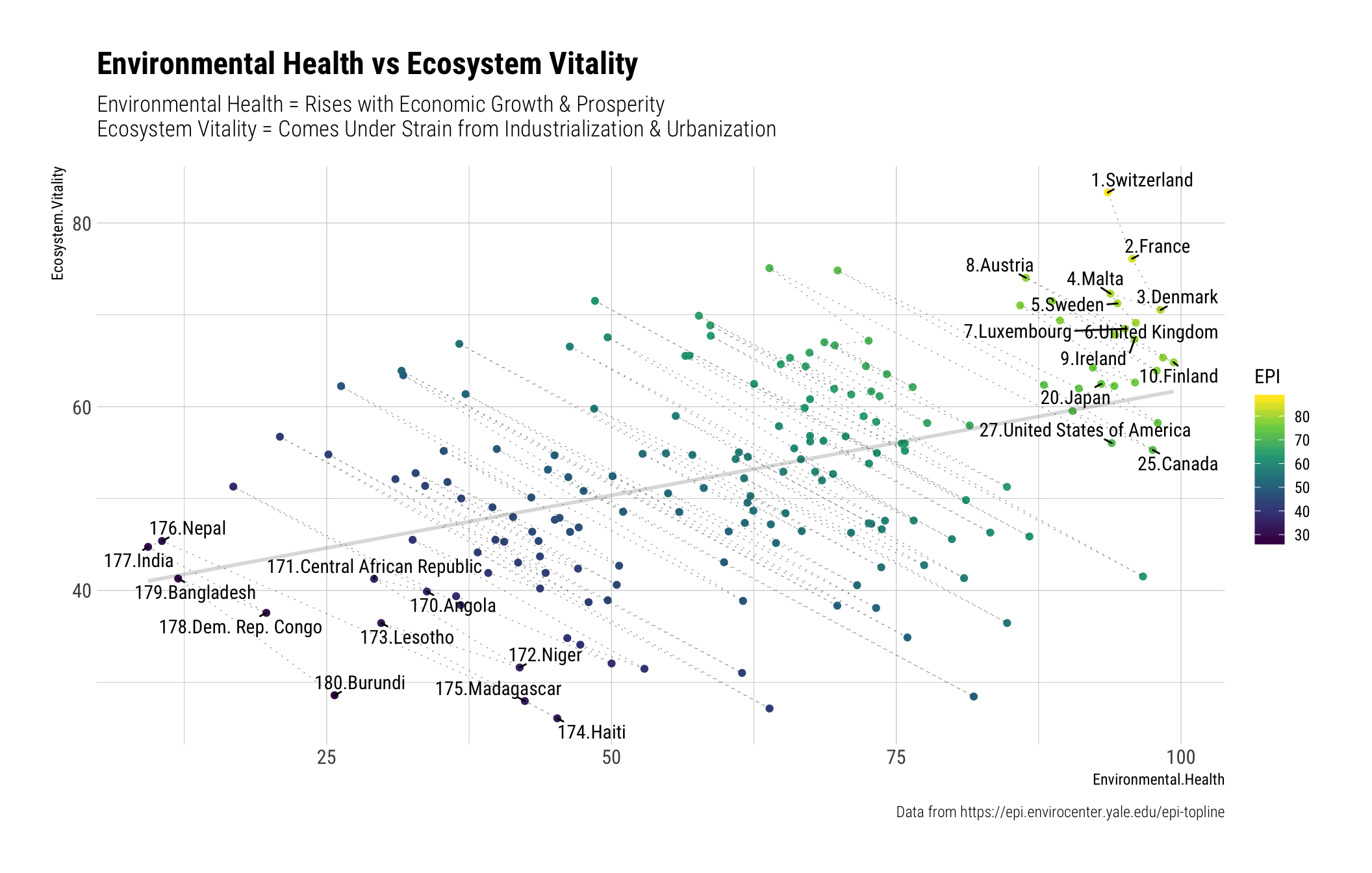
I’ve labeled top 10 countries, and bottom 10 countries, also US, Canada and Japan. US was only ranked at 27th, which I thought was quite low, Japan was higher than US, at 20th. I was also surprised that canada is also lower at 25th.
Using countrycode package, I wanted to append extra information about country, such as “Continent” and “Region”.
I’ve coloured plot with “continent” to see if there’s a cluster…
library(countrycode)
library(ggalt)

epi_2018_df <- epi_2018_df %>%
  mutate(continent = countrycode(Country ,"country.name", "continent", warn=F),
         country_code = countrycode(Country, "country.name", "iso3c",nomatch = ""),
         region = countrycode(Country, "country.name", "region", warn=F))

epi_2018_df <- epi_2018_df %>%
  mutate(detail_url = paste0("https://epi.envirocenter.yale.edu/epi-country-report/",country_code))

## Micronesia didn't get categorized...

epi_2018_df %>%
  ggplot(aes(x=Environmental.Health , y= Ecosystem.Vitality, color=continent)) +
  geom_point(aes(color=continent), size=3, alpha=0.6) +
  geom_encircle(na.rm=T, s_shape=1, linetype=3, alpha=0.6) +
  scale_color_viridis_d(name="Continent", na.value="grey", option="A", end=0.9) +
  geom_rug(alpha=0.3) +
  theme_ipsum_rc() +
  geom_text_repel(aes(label=paste0(EPI.Ranking,".",Country)),
            family="Roboto Condensed", min.segment.length=0, size=2,
            color="#00000090", segment.colour = "#33333350") +
  labs(title = "Environmental Health vs Ecosystem Vitality",
       subtitle = "Colour = Continent") +
  scale_x_continuous(breaks=round(fivenum(epi_2018_df$Environmental.Health),1)) +
  scale_y_continuous(breaks=round(fivenum(epi_2018_df$Ecosystem.Vitality),1))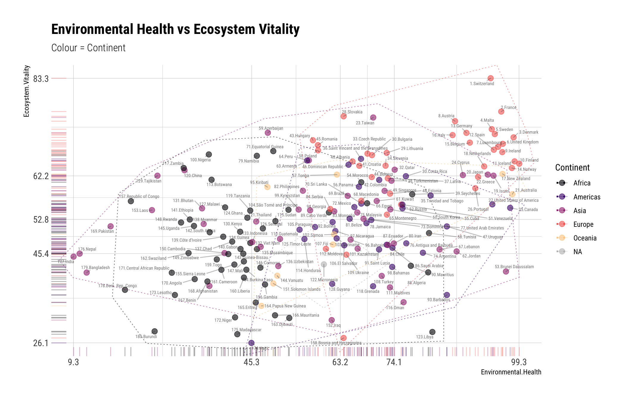
After I’ve done the above, I realized there are actually Downloads section on EPI with more data… So I actually didn’t have to scape the website table, nor code the region using countrycode.
I’ve decided to download 2018 EPI Country Snapshot for now. This table contains 12 variables for 180 countries, with stats like GDP, GDP per Capita, Land Area, Population, Popular Density, Population Growth Rate and SDGI (I’m not sure what SDGI is, and I couldn’t figure out from browsing through the web…)
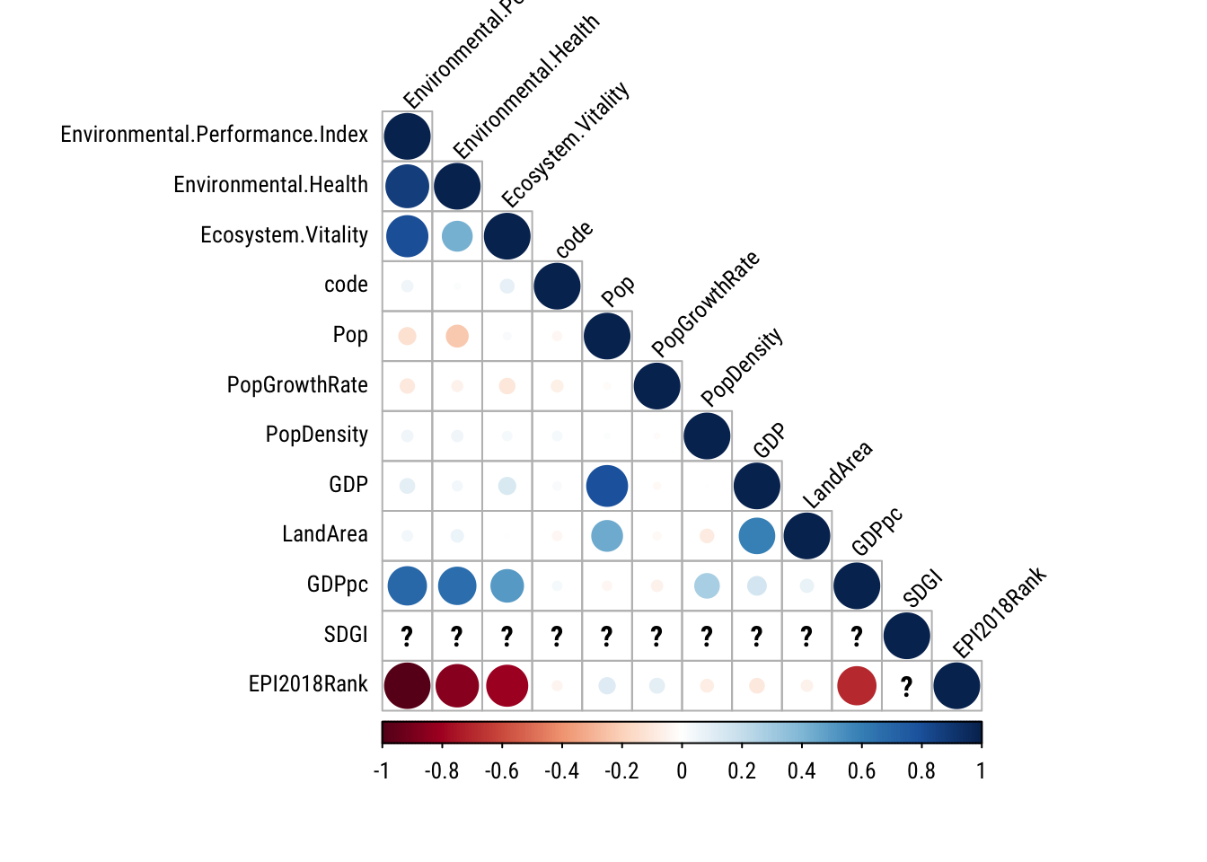
While I know EPI, Environmental Health, and Ecosystem Vitality should be correlated, it’s interesing that EPI and GDP per Capiata is correlated strongly. So I’ve decided to create another scatter plot showing that relationship.
epi_2018_df_comb %>%
  ggplot(aes(x=GDPpc, y=Environmental.Performance.Index )) +
  geom_point(aes(color=PopDensity)) +
  theme_ipsum_rc() +
  geom_smooth(se=F, method="lm", color="#33333330") +
  scale_x_comma() +
  scale_color_viridis_c(trans="log10") +
  geom_text_repel(aes(label=country),
                  data = . %>% filter(GDPpc > 60000 | Environmental.Performance.Index > 80 |
                    country %in% c("United States of America","Japan","Canada","India","China")),
                  family="Roboto Condensed", min.segment.length = 0, nudge_x=10) +
  labs(title="GDP per Capita vs EPI",
       caption = "Data Source: https://epi.envirocenter.yale.edu/epi-downloads",
       xlab ="GDP per Capita - 2018", ylab="Environmental Performance Index")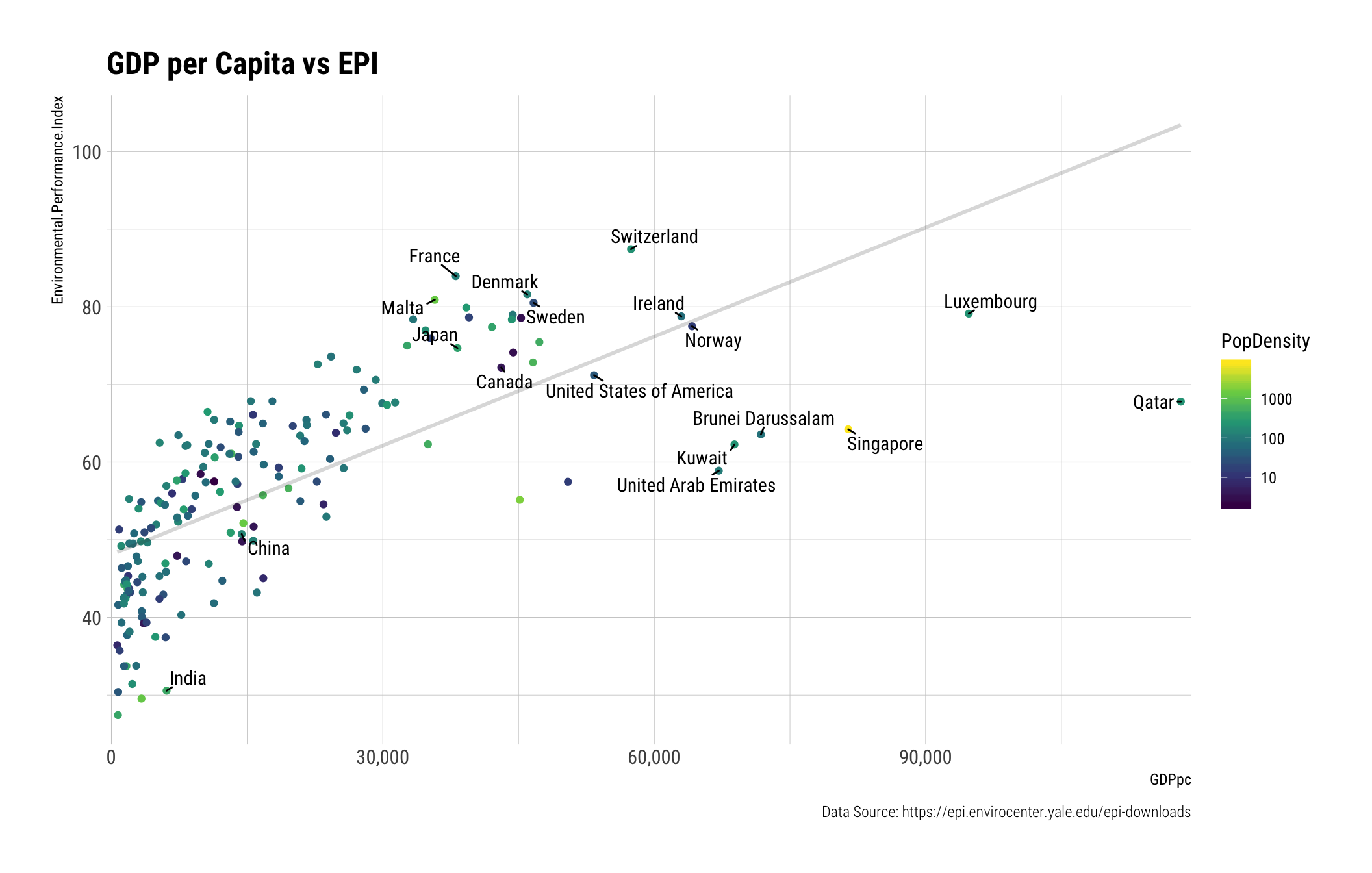
Share this post
Twitter
Google+
Facebook
Reddit
LinkedIn
Pinterest
Email