Quite often when you just want to whip out some quick plots, I like to assign the colours by colour names. Some of my go-to colours are… tomato,darkorange,turquioise,darkgrey,lightgrey.
Recently I realized that I can get all of built-in colour names available in R to use by typing colors() or colours(). So I thought I’ll do bit of studying on colour names.
After staring at colour names for bit, it really made me wonder who has came up with these selection of colours in first place. I liked that there’s colour name like “lemon chiffon”, “peach puff”, “papaya whip”, “mint cream”, “chocolate” - although chocolate didn’t seem like the colour I’d typically associate with chocolate myself.
In general, built-in colour names looked quite random, aside from the fact that some colours have variations with suffix 2,3,4,5 etc. There are pale, light, medium, dark, deep colour variations too, but it didn’t seem like not every colour comes with those variations either.
So I wanted to see if there’s anyway I can visualize the built-in colours.
## Here's list of packages I'm going to use.
library(tidyverse) ## For everything...
library(tidygraph) ## Goew well with ggraph :)
library(ggraph)  ## Been wanting to use this!
library(ggforce) ## Another amazing package I've been wanting to test
library(scales)  ## Making Rescaling Easy
library(tidystringdist) ## stringdist but tidy!
library(data.tree) # To make tree from data frame

## display 15 random colours out of 657 colour names.
colors() %>% sample(size=15)
## [1] "gray73" "grey15" "grey91" "grey9"
## [5] "cornsilk4" "darkgoldenrod3" "mintcream" "grey"
## [9] "grey3" "gold2" "gray26" "white"
## [13] "salmon2" "gray9" "slategray4"R-Built In Colours - Abstract Plot
First, I’ve decided to make nice tibble from the vector of colour names, then plot them using ggplot2. I have really wanting to test out ggforce package.
## color_df will contain all of colours that are built-in with extra info about the colour.
color_df <- tibble(
  name = colors(distinct=F)
) %>%
  mutate(idx = row_number(), # original sorting order
         rgb = map(name,col2rgb),  #color name can be converted to rgb
         hsv = map(rgb, rgb2hsv),  #rgb can then be converted to hsv (I like using hue)
         h = map_dbl(hsv,1),  # get the hue from hsv
         s = map_dbl(hsv,2),  # get the saturation from hsv
         v = map_dbl(hsv,3),  # get the lightness? darkness? from hsv
         hue_angle = rescale(h,to=c(0,2*pi), from=c(0,1)),  # convert hue value to angle
         name_parent = str_remove(name,"\\d+"), # some colours have numeric variation of same color
         name_num = as.numeric(replace_na(str_extract(name,"\\d+"),0))) %>%
  add_count(name_parent, name="n_children") %>%
  select(-rgb,-hsv)  %>%  ## just discarding from the tibble to make it smaller.
  filter(n_children<10)  ## this will remove many shades of grey|gray family - there's over 100 of them..  So I'll just exclude them for this colour study.

## Also noticed that typically there's colour name with typical variations.
color_df <- color_df %>%
  mutate(modifier=str_extract(name,"(light|pale|medium|dark|deep)"),
         name_grandparent = str_remove(name_parent,"(light|pale|medium|dark|deep)"))

## Using hue & saturation to set x-coordnate, using hue & value for y-coordinate
color_df <- color_df %>%
  mutate(x_pos = dense_rank(s*cos(hue_angle)),
         y_pos = dense_rank(v*sin(hue_angle)))


## Colour Plots
base_plot <-color_df %>%
  ggplot(aes(x=x_pos,y=y_pos)) +
  # Connect the colours that is same family with dotted line
  geom_line(aes(group=name_parent, color=name_parent), linetype=3) +
  geom_point(aes(color=name, size=(name_num+1)/n_children)) +
  # I want to put another circle around colour that are numeric variation of some colour.
  geom_point(aes(color=name, size=n_children+1), shape=21,
             data=. %>% filter(name!=name_parent)) +
  scale_color_identity()  +
  scale_size_continuous(guide="none", range=c(4,8)) +
  theme_void() +
  theme(plot.background=element_rect(fill="grey8"),
        plot.title = element_text(family="Roboto Condensed", color="white"))

base_plot 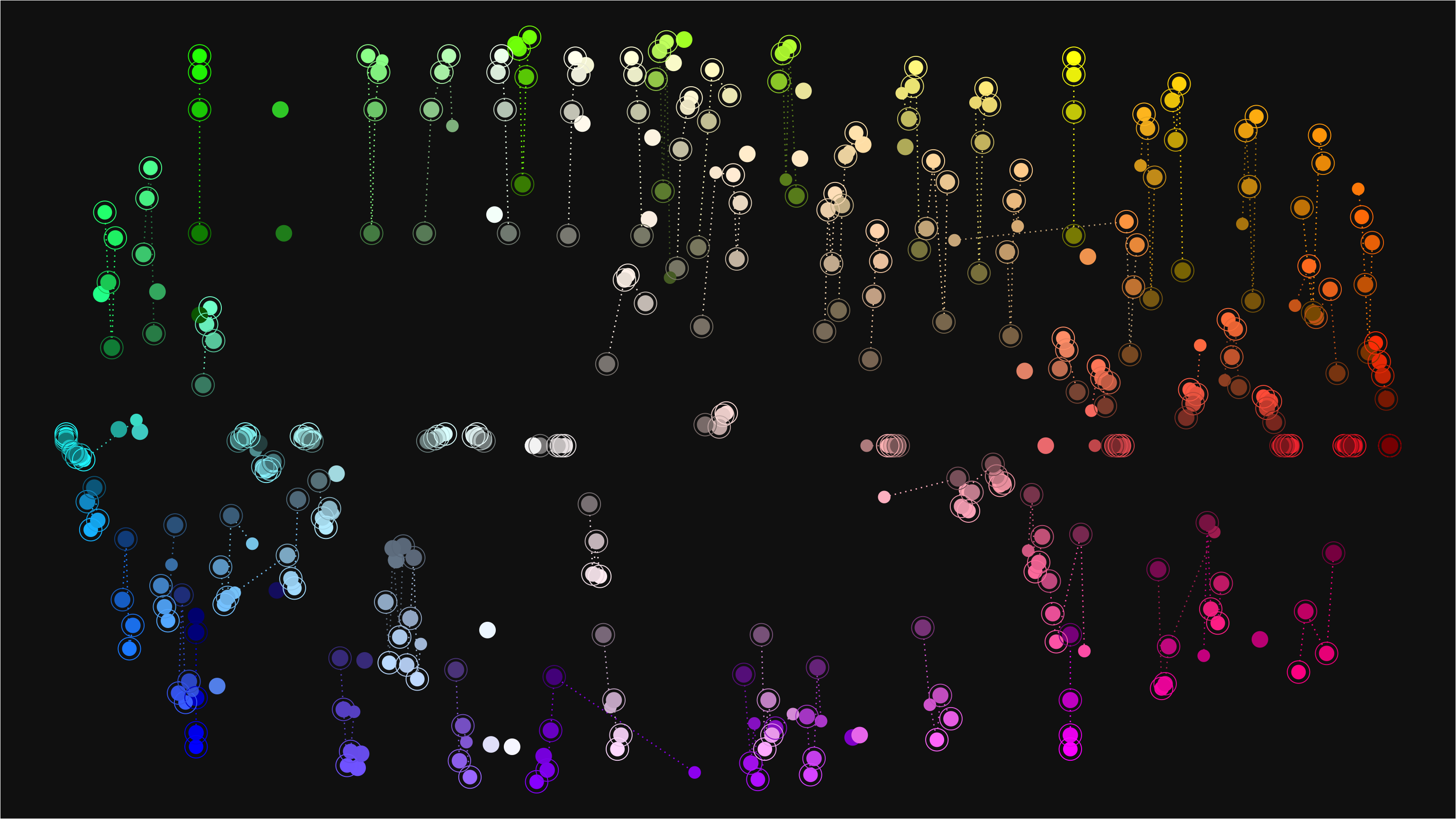
Then I wanted to try geom_mark_* function from ggforce ever since I saw some examples on twitter I’ve been wanting to try it myself.
annotate_color <- function(x) {

  cap_text <- ifelse(x==1,"Colour with No Family", str_glue("Colour with {x} Colours in a Family"))

  base_plot +
    geom_mark_rect(aes(group=name_parent, color=name_parent,
                       label=str_c(name_parent)),
                   label.margin=margin(0,0,0,0,"mm"),
                   label.buffer=unit(1,"mm"),
                   label.fontsize=13, label.family="Roboto Condensed",
                   label.fill="#000000ae", con.colour="#ffffffae",
                   data = . %>% filter(n_children==x),
                   label.colour="#ffffffae",
                   con.cap=unit(0,"mm")) +
    labs(title=cap_text)

}

annotate_color(1)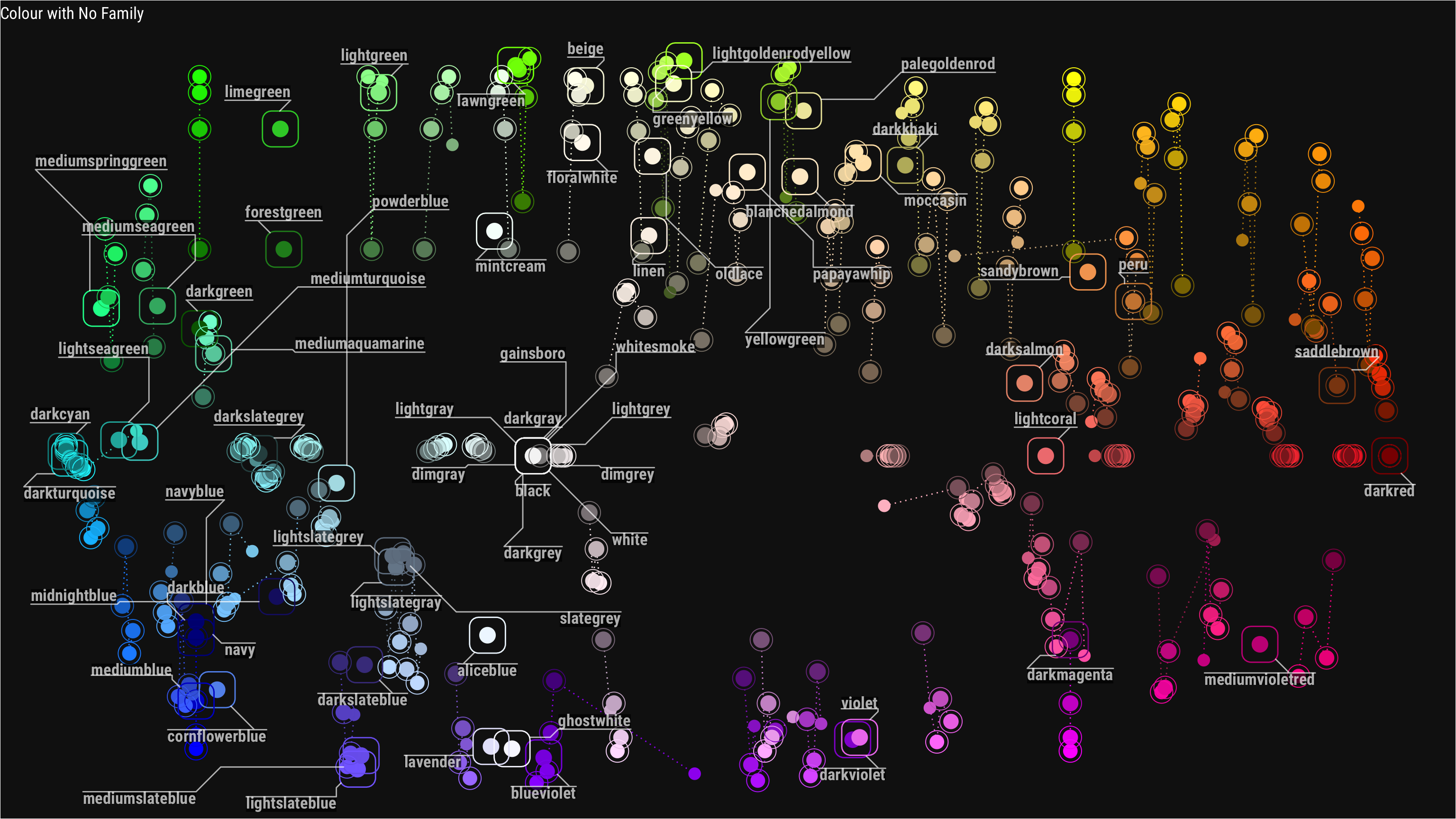
annotate_color(5)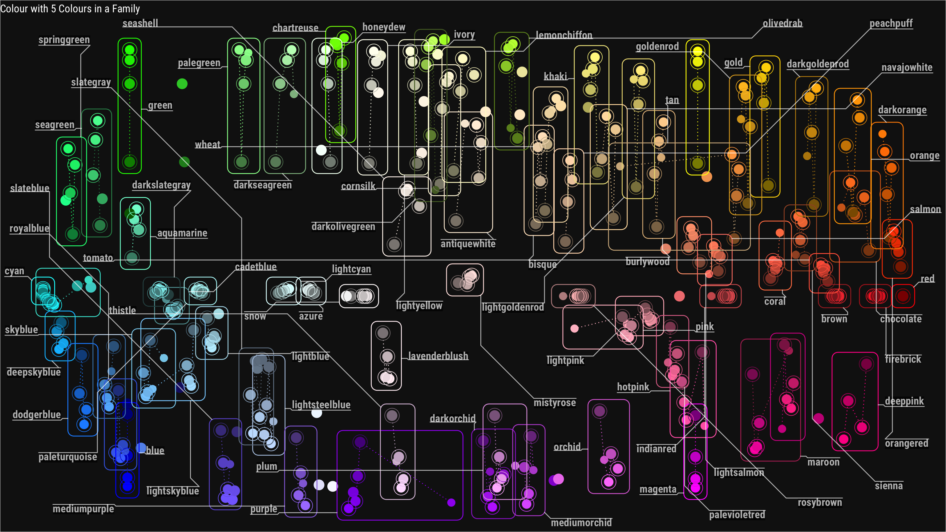
Network Visualization of Built-in R Colours
I recently saw the annoucement of updated package ggraph, and after seeing bunch of example plots inspired me to do below. Really amazing package!
I thought it would be really neat to put nodes the colour close together if colour names are similar. This has lead me to another great package called tidystrtingdist!
## first create tibble that list all of combination of colour names using tidy_comb_all function from tidystringdist package.
color_comb <- tidy_comb_all(color_df$name)

## then compute string distances using different method. q for qgram, jaccard, cosine, p for jw.
## I couldn't figure out which method is more suitable...  Still trying to put my head around for the different string distance metrics.
color_comb_dist <- tidy_stringdist(color_comb,
                                   method=c("jw","osa","jaccard","cosine","qgram","lv"),q=1,p=0)


## 1 take a peak at the table - What's similar to colour name tomato?
color_comb_dist %>% filter(V1=="tomato") %>% arrange(jw) %>% head(5) %>% knitr::kable()| V1 | V2 | jw | osa | jaccard | cosine | qgram | lv |
|---|---|---|---|---|---|---|---|
| tomato | tomato1 | 0.047619 | 1 | 0.2 | 0.0465374 | 1 | 1 |
| tomato | tomato2 | 0.047619 | 1 | 0.2 | 0.0465374 | 1 | 1 |
| tomato | tomato3 | 0.047619 | 1 | 0.2 | 0.0465374 | 1 | 1 |
| tomato | tomato4 | 0.047619 | 1 | 0.2 | 0.0465374 | 1 | 1 |
| tomato | whitesmoke | 0.400000 | 8 | 0.7 | 0.5435645 | 10 | 8 |
#color_comb_dist %>% filter(V1=="darkorange") %>% arrange(jw) %>% head(5)

## How is distance metrics distributed?
color_comb_dist %>%
  gather(key="method", value="value",-V1,-V2) %>%
  ggplot(aes(x=value)) +
  stat_density(fill="seagreen3") +  #I'm going to use some colour that I learned that exist!
  facet_wrap(~method, scales="free") +
  theme_minimal()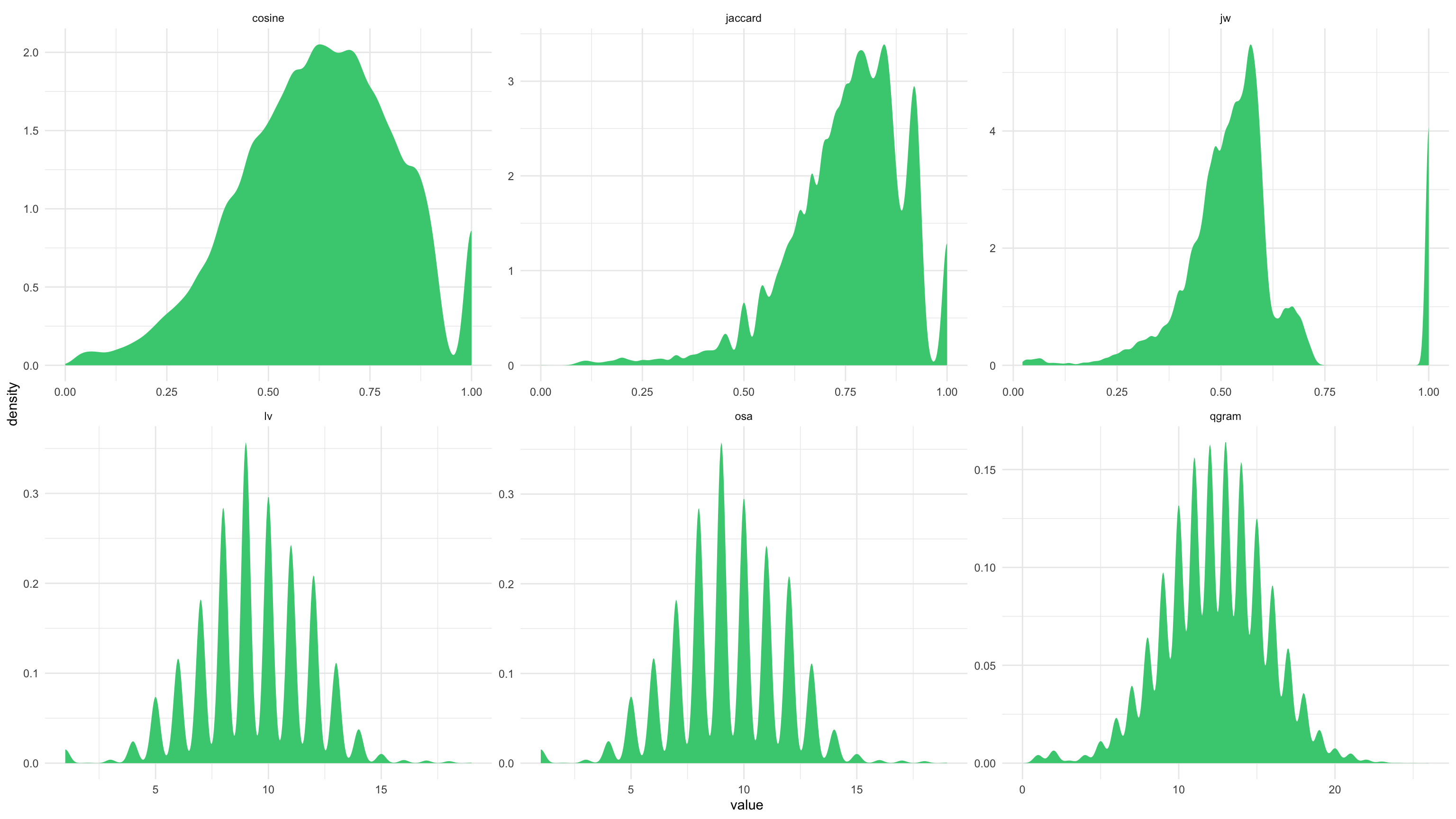
# Cosine, Jaccard, Jaro  - distances is expressed between 0 and 1, 0 being exact match, 1 totally different.
# lv, osa, qgram - integers value, smaller the value, similar the strings.
I’ve decided to use Jaro distance for below. I didn’t want all of nodes (colours) connected to every other colours in network visualization, so I’ve chosen threshold of 0.25 to filter out the edges I don’t want to be present in network visualization.
## Creating Edges & Nodes Data Frame First
edges <-color_comb_dist %>%
  select(from=V1, to=V2, jw) %>%
  filter(jw<0.25)

nodes <- color_df %>% select(label=name,x=x_pos,y=y_pos, everything()) ## I don't need everything, but thought I'd just keep extra attributes about nodes to play around.

g <- tbl_graph(nodes=nodes, edges=edges, directed=F) %>%
  mutate(deg = centrality_degree(),
         hub = centrality_hub(),
         comm = group_edge_betweenness(),
         is_parent = (label==name_parent)) ## if colour name does't have variation then name shoudld be same.

g %>%
  ggraph(layout="fr") +  ##graphopt, kk, drl, fr , dh - i like fr for this graph
  geom_edge_fan(alpha=0.25, color="white") +
  geom_node_point(aes(color=label, size=deg)) +
  geom_node_text(aes(filter=(is_parent), label=label, color=label),
                 repel=T, family="Roboto Condensed", size=3, angle=10) +
  #geom_mark_ellipse(aes(x=x,y=y,group=comm), color="snow", linetype=3) +  ## if you want to see how community is formed.
  scale_color_identity() +
  scale_size_continuous(range=c(6,2), guide="none") +
  theme_graph() +
  theme(plot.background=element_rect(fill="gray8"))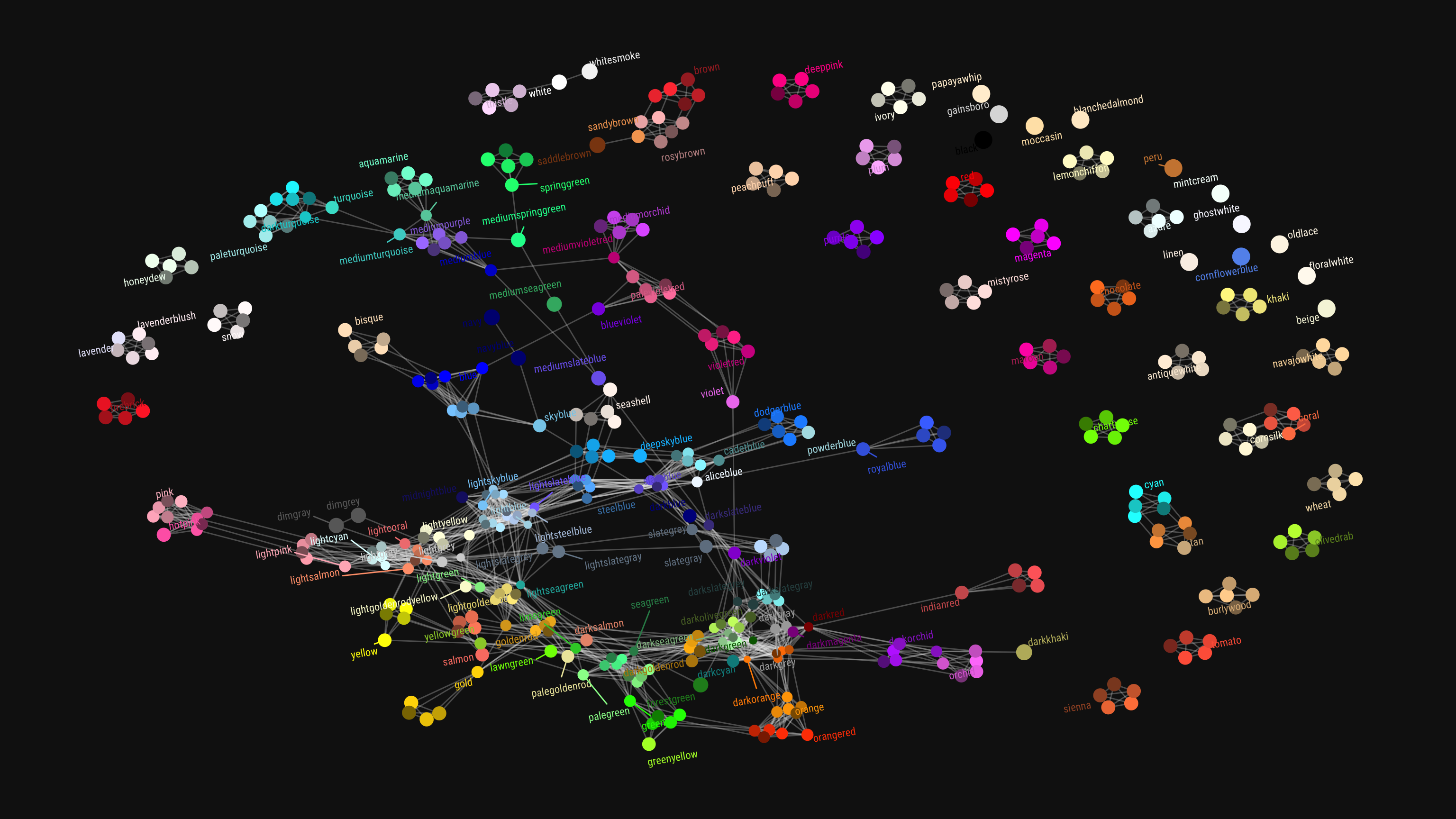
### You can always save the png...
## ggsave("~NetworkViz_R_BuiltInColour.png", width=16*1.5, height=9*1.5)
After studying the above network visualization, I realized the ones clustered together closely are the ones that has word “light”,“pale”,“deep”,“dark”, “medium” in general, but not all colours comes in all these variations. It also made me think the differences between light vs pale, dark vs deep too.
Extra: Still trying to demysitify the Colours…
library(data.tree)

## light, pale, medium, dark, deep...  when are these word used?
color_df <- color_df %>%
  mutate(modifier=str_extract(name,"(light|pale|medium|dark|deep)"),
         name_grandparent = str_remove(name_parent,"(light|pale|medium|dark|deep)"))

## Make it into tree format
color_df_unique <- color_df %>%
  mutate(pathString=paste("color_r",name_grandparent,
                          ifelse(name_parent!=name_grandparent,name_parent,""),
                          ifelse(name!=name_parent,name,""),sep="/"))


color_tree <- as.Node(color_df_unique)
color_tree_g <- as_tbl_graph(color_tree) %>% ## there's no nodes table at this stage...
  as_tbl_graph() %>% ## this seems to do what i want?
  mutate(color=ifelse(name %in% colors(),name,"#ffffff"),
         is_rcolor=(name %in% colors())) %>%
  left_join(color_df %>% select(name, h,s,v, modifier,n_children), by="name") %>%
  arrange(h,s,v)

tree_a <-color_tree_g %>%
  ggraph(layout="partition") +
  geom_node_tile(aes(filter=is_rcolor, fill=color), color="#ffffff10", size=0.1) +
  scale_fill_identity() +
  theme_graph() +
  coord_polar()

tree_b <- color_tree_g %>%
  ggraph(layout="treemap") +
  geom_edge_fan(color="grey33", alpha=0.3) +
  geom_node_point(aes(filter=is_rcolor, color=color), size=3, shape=16) +
  scale_color_identity() +
  theme_graph() +
  coord_fixed()

tree_c <-color_tree_g %>%
  ggraph(layout="tree", circular=T) +
  geom_edge_fan(color="grey33", alpha=0.3) +
  geom_node_point(aes(filter=is_rcolor, color=color), size=3, shape=21) +
  scale_color_identity() +
  theme_graph() +
  coord_fixed()


library(patchwork) ## makes it so easy to put ggplots together side by side
tree_a + tree_b + tree_c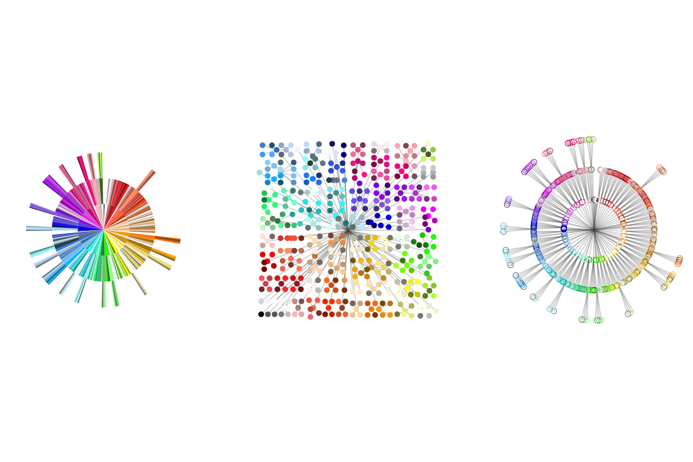

Twitter
Google+
Facebook
Reddit
LinkedIn
Pinterest
Email